

Data analytics are becoming more accessible for higher education institutions. Giles Carden, an advisor and co-designer at HESPA, offers some tips about how to make the best use of them.
Data analytics are now relatively widespread in UK higher education and the advent of the HESA and Jisc Business Intelligence initiative, supported by HESPA, is ensuring that even the smallest institutions who subscribe to HESA will have some form of analytics capability.
However, simply having the analytics capability is not enough. Far more important is how you present analytics and how they are embedded in decision making – these elements are crucial.
The design of good analytics is something that one has to learn. My ethos around analytics design is that the data should be presented in a clear, simple and unequivocal fashion – that the data should largely speak for itself.
In general, if it is well presented, any narrative relating to the analytics should spend less time explaining the data and more time stating what it does not show or do.
Presenting analytics
What does good presentation comprise? The first and most important step is to know your audience. Is it a data savvy audience or a community that rarely looks at data?
The next step is to acknowledge that each chart should endeavour to answer one or more business question. One should then choose the best and most appropriate type of chart to illustrate the data, for example, bar chart, scatter plot, chord diagram, heat map etc.
In making the choice of chart type one should also think about whether there is a need to contextualise, benchmark or normalise the data or consider how it changes with time.
The next step is to think about using the appropriate scale and to ensure the visualisation is clearly labelled and titled.
Finally, but of no less importance is the choice of colour palette.
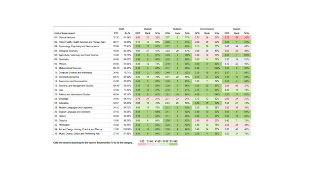
Some examples of effective visualisations that we use at Warwick are shown below. The first shows the use of a heat map, a hybrid type of visualisation that combines elements of both a chart and table. The heat map very effectively summarises a single institution’s Research Excellence Framework outcome in detail, showing the results for each unit of assessment in a single visualisation.
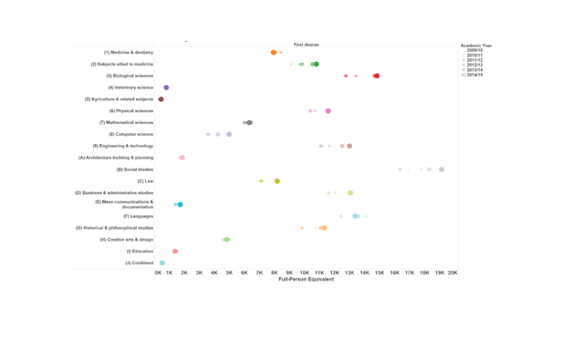
The second visualisation shows student enrolment data from 2009/10 to 2014/15 by subject area. It is akin to a bar chart but each of the data points for a specific subjects represents a particular year. The smallest data point is data for 2009/10 and the largest for 2014/15 which provides a sense of trajectory for the data. The chart condenses a considerable amount of data covering six years into a single image.
Analytics aesthetics
The analytics team at Warwick and myself are disciples of the American analytics aesthetics evangelist Stephen Few, the founder of PerceptualEdge.com.
Few provides training and consultancy on data visualisation and sense making. He has also has written books such as Show Me the Numbers and Information Dashboard Design. Few is one of the world’s leading experts on how to present quantitative information by means of graphics and I would strongly recommend you refer to it if you have an interest in excellence in presenting analytics.
Well-designed visualisations are all very well, but ensuring the data is used is even more important. There is a danger that glossy dashboards and reports can languish in a dark part of the digisphere or a dusty corner of university planning offices and play little or no part in supporting decision making.
Dashboards and reports should have a clear business purpose and be directly embedded in decision making processes; sometimes the decision making process may even need to be adapted or changed.
All universities have an extensive range of committees and decision making apparatus. It is useful to set-out a framework which describes how analytics flow through and are embedded in the committee system, which decision making body has ownership for a signal or performance attribute and for acting on the signal.


